http://www.huffingtonpost.com/2014/11/10/feminism-not-humanism-youtube_n_6132414.html Humanism vs feminism
http://terribleminds.com/ramble/2014/09/25/why-i-prefer-the-word-feminist-over-equalist/comment-page-2/ Why feminism is used and not equalism!!
http://www.guerrillagirls.com/#open (website of the Guerrilla girls, who fight for equality in art, including fighting against sexism.)
http://www.heforshe.org/en (feminist website focused on including males in the movement for equal rights)
http://www.theguardian.com/artanddesign/2015/oct/18/bambi-graffiti-artist-female-banksy-street-art-feminism (Bambi, female graffiti artist and feminist, described as a female-Banksy, which in itself is somewhat sexist, likening her work to another man’s instead of acknowledging her as her own artist)
It is interesting to note that Urban Dictionary (http://www.urbandictionary.com/define.php?term=Feminism) has many definitions of Feminism. Urban dictionary is full of vulgar, rude, misguided and opinionated definitions of words both legitimate, and colloquial. It does contain accurate information, but it is more widely known as containing humorous, and potentially offensive definitions of words. However, it’s definitions of feminism, at least the first ones loaded as the ‘top definitions’, are accurate, well informed and generally not at all what I expected from Urban Dictionary. I found the top definition to be more informative and understandable than the one that Merriam Webster gave me. Of course, skip through the page or so few definitions and you stumble across the ‘man hater’ jokes and accusatory definitons, but those were to be expected from the start.
http://everydaysexism.com/about
A website where you can post your own stories about being discriminated against or sexist encounters, which can be anonymous or not. It’s purpose is to remind people that sexism is still a serious problem, and needs to be addressed.
http://www.telegraph.co.uk/women/womens-life/11609224/Sexist-beer-adverts-leave-me-frothing.-Leg-spreader-anyone.html
article about sexism in the beer industry
http://www.theguardian.com/media/2015/may/14/sexist-beer-ads-fosters
more examples of sexism in alcohol marketing, and why it needs to change
http://www.dailymail.co.uk/news/article-3080856/Sexist-adverts-women-beer-says-Foster-s-boss-Chief-says-time-campaigns-insulting.html
article explaining that the sexist advertising beer companies have used are driving their female customers away. It explains that nowadays, there are twice the amount of women (in the UK) who drink lagers and beers, which means that the sexist advertising targeted at men is becoming totally void and increasingly damaging.
In New Zealand
http://www.radionz.co.nz/news/national/299931/women’s-worth-and-sexism-in-sport I piece on women’s sport in New Zealand, and how they don’t get as much coverage, support or money in comparison to the men’s teams
http://www.radionz.co.nz/news/political/288360/how-sexist-is-new-zealand-politics (News piece on NZ Politics and how nowadays it’s improving, but there’s still a way to go)
http://www.nzherald.co.nz/lifestyle/news/article.cfm?c_id=6&objectid=10822330
sexism in the NZ workplace, asking about future pregnancies in interviews.
http://www.stuff.co.nz/sport/opinion/637729/i-Sport-the-last-bastion-of-sexism-i
more about sexism in sport, not just in New Zealand but also in Australia, and examples from elsewhere around the globe.
Advert Ideas and Stuff
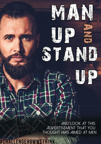 I don’t particularly feel that this ‘man up’ poster works the best, but it is heading in the right kind of direction. Upon first glance, it would appear to be an ad for men, what with the hegemonically masculine man, arms crossed and intense beard and the rough looking title text. However the tagline clearly brings to light the idea that because of this you immediately thought this was an ad for men and about men. Not perfect, but it’s helped me realise the kind of direction I want to go in.
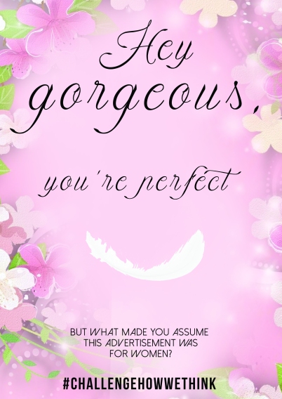
I really like this poster (ABOVE) because it highlights the immediate associations people have with femininity, and also challenges why you would think that way. By using stereotypical techniques common in advertising aimed at women, it represents every feminine advert ever, and yet it also doesn’t. It’s simple, yet fairly straightforward to understand, which is important if I want it to be seen and recognised by large amounts of people.

I created the above poster as a bit more of an extreme take on the sexist advertising in alcohol marketing. I’m hesitant to use this one, not simply because it’s very edgy, but because I don’t feel I have a tight enough grasp on what sexism is to start to attack it so aggressively. I like the idea of the advert, and how challenging it is, but it would be tricky to justify exactly what it means and exactly how I came to an educated decision to create it. It’s simply a bit of a visual joke that requires more in depth understanding, that I currently lack.

The above poster is a toned down version of the previous one. It still highlights the same issues, but is more passive and contemplative and questioning as opposed to aggressive attack. I don’t know if I like it over the “hey gorgeous” poster, but I feel it addresses another key issue with sexism in our modern day society. Also, having a ‘sexy model’ to advertise against sexism could quite easily be seen as hypocrisy, and would be difficult to argue against with my limited knowledge.


